“Design is a silent ambassador of your brand”
Design is more than just brand identification. It provides benefits that go beyond visual design. Proper design is a chance to educate and inform the audience, as well as to convince them of the usefulness of the brand through color transitions, personalized fonts, and illustrations.
The world of graphic design is an ever-changing landscape. Here you can come up with tens of thousands of styles because trends can replace each other year after year. What does this mean for you? You need to constantly improve your skills and align them with the latest trends in order to get the maximum benefit.
In this article, we will discuss all the design trends that will become the foundation of 2021. From the most popular illustrations and layouts to the new approaches used by professionals, we will tell you everything. Look for new design ideas and instill visual consistency into aspects of your business.
Minimalism
Is this obvious to you? Excellent. So your site or product looks attractive. Minimalism is an irreplaceable trend of the last few years. Designers strive to sweep more and more elements and leave maximum “white space”.
You must follow minimalism in graphic design. Even if you do not like this direction. Reason: minimalism has become popular in everything from websites and gadgets to banner ads and clothing.
Minimalism has penetrated so much into all areas that a person automatically takes better sites with a similar graphic design. Therefore, your motto for 2021 is – “We are minimalistic”.
Simple and personalized fonts
Speaking of details, let’s start with fonts. Why? Content is the “king” of a site or ad post. First, without it, the user will not see the point of staying on the page. Similarly, he did not pay attention to ads without text.
Secondly, content is necessary for indexing a site by search engines. But the content must be properly formatted. What kind of font is suitable for this?
First of all, fonts will be saturated. In the last few years, more and more attention is paid to the bold type, as it focuses attention. But at the same time, fonts will also be associated with minimalism. There will be no angles or serifs.
What is remarkable, even in such simple fonts there will be personalization. Experienced designers can easily distinguish a specialized Netflix or Mountain Warehouse font. If you do not plan to develop your personal font, we recommend using:
- Roboto;
- Open Sans;
- Zona Pro.
Colors
The second element without which no graphic design lives are color. Last year, its choice very much depended on the scope of the company. Today, these boundaries are a little blurred. In 2021 there will be much more freedom for color matching. First of all, designers and many brands drawback from bright colors. 2020 was the year of the color “neo mint”. Blue and yellow shades were also popular. However, all the palettes came down to pastel colors.
Therefore, the year 2021 will be tied to dimmed colors. What does it mean? No adjustments to brightness and contrast. Black and white will be added to the palette to maximize the appearance of the color.
But the entire site, application, or product are not always executed in one color. Combinations must be created to dilute visual perception.
Of course, the best combination is black and white. It has existed since the days of newspapers, and most consumers love it at the genetic level. However, black and white are the backbones of most Apple pages. If you choose this combination for your product, some users may blame plagiarism.
Therefore, designers highlight such color combinations:
- sea blue and mint;
- mustard and beige;
- black and lime;
- pink and secret moss;
- black and red scarlet;
- soft green and white.
All these color combinations were taken as a basis on most sites that were selected the best by a version of Awwwards.
Gradients
The designer knows that there are hundreds of shades for each color. Every year this fact is increasingly used to create a more attractive product design. Gradients are a trend in graphic design over the past three years. As polls and expert comments show, so far no one intends to forget this trend.
Why are gradients so popular? Firstly, they provide more space for creativity. Secondly, the user is ambiguous. He loves minimalism but is inclined to think that they did not try to work on design when he sees just two colors. Thirdly, the gradient creates a sense of movement. This is an analog of motion design but without animation.
A few tips for creating gradients:
- Do not choose colors randomly. The gradient is good in that you can choose any color. But it must match the mood of a particular element of the page or product. If you are afraid to make a mistake, use Adobe Color Wheel.
- Use the colors of nature. It pleases the eye of any person. Seeing similar colors on the product, the user will be pleasantly impressed.
Simple illustrations
When developing a website design, we often use stock images and photographs. If your brand is already several years old, then continue in the same vein. The user is used to this style. But if you are starting a new project, pay more attention to simple, drawn illustrations. Firstly, you can make more variety. Secondly, you make the user love the product.
Simple illustration example. (source of image)
After all, he is tired of stock images. When they appear on sites that have existed for a long time, the consumer has a sense of understanding that this is a brand. But if stock images are added to new sites – it seems to the user that the designer did not put up creativity.
Vintage effects
Now look at the street and notice how all the old trends are returning to fashion. Baggy oversized clothes, dimmed colors, old street brands – all this is now the most relevant for any audience.
Use it in graphic design. Bring your consumer back to the past. Add to the illustrations a burnt-out photo of the city or an image of an old car. A positive effect is guaranteed both among the older generation and at the level of teenagers. Why?
Generation X and Y will immediately remember how good they were in those days. You will awake a feeling of nostalgia. Generation Z will be able to touch that “beauty” that parents tell them about.
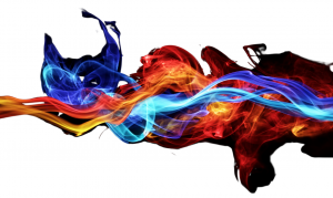
Liquid forms
How many sites and products with sharp outlines have you seen? Most users admit that this appearance of the product scares them away. This is noticeable not only in graphic design. Pay attention to cars: all transitions are smooth (except for Tesla Cybertruck, but it deserves a separate discussion). Smartphones that have become an integral part of many people’s lives also have round edges.
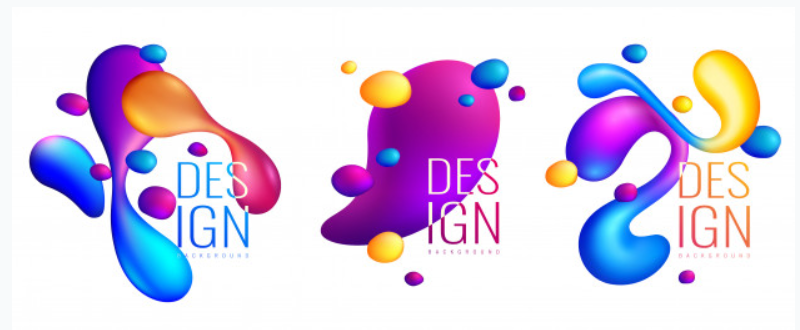
Liquid Form Example. Source of the image
Strictly fixed edges and bends are a relic of the past. They symbolize monotony. At the same time, liquid forms imply creativity, agility, and most importantly – create the effect of movement. The absence of strict bends helps to achieve a smooth, soft appearance. Many designers want to recreate it in each of their products. Thus, they definitely make liquid form one of the main trends for several years.
Overlay and overlap
Overlaying one image on another can make content perception difficult. Nevertheless, this approach creates an additional depth to the picture. It also catches the user, motivating him to view the image in more detail.
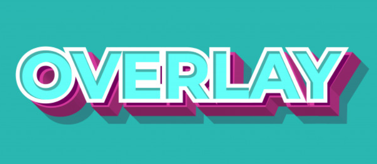
Text overlay effect. Source of the image
Again, using the overlay effect, designers have more creative options:
- make one element translucent for connecting images;
- overlapping of one element by another;
- creating linear images on top of illustrations;
- overlapping fonts using color;
- combination of photographs and drawing.
All these effects significantly impair the readability of images. But the proper use of overlays and overlaps makes the content more effective. The consumer will want to understand what is hidden behind all these drawings.
Animations
If we are talking about posters, banners, logos, and clothing design, then there can be no animation here. But today, graphic design is increasingly associated with sites, mobile applications, and digital advertising. In all these cases, the animation is simply necessary.
Companies are devoting more and more time to developing attractive and unique animations. Why? They can hook any user several times stronger than a normal picture.
In addition, the animation is one of the most powerful ways to revitalize a brand. However, this is now beyond the scope of simple GIFs. Companies develop animations as a plot, including continuous movement, in which each part of the chart is tied to a subsequent scene.
In 2021, continuous animation sequences will enhance the user’s immersion in the site and all content. Why? Real-time smooth transitions can create a mini-scene from the elements of a single frame. This is useful for brands. This way they can send users on a trip. In addition, in this way, they will give the consumer a sense of life in an ever-changing world.
The animation is already magical. Dynamic transitions are a “secret spell” to hold the user.
Data visualization
Big Data is a new section of innovation. Each sphere is so oversaturated with information that the simple transfer of numbers or images is no longer possible. That’s why companies focus on data accessibility.
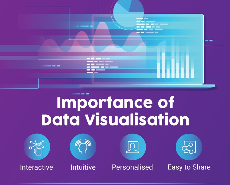
Benefits of Data Visualization.Source of the image
Data visualizations are part of the animation. However, a simple animation may not carry a semantic charge. Accordingly, it attracts less attention. If there are statistics in the animation, the user will definitely look at them. Data visualization and animated elements play a significant role in modern graphic design. If your area of activity is related to data that needs to be shown to each user, use animation.
Firstly, you will save a potential client from long page scrolling. Secondly, you can convey information more elegantly. Thirdly, this effect will become one of the business cards of the company. You will be remembered.
Bonus: Be real
Every year more and more they talk about theatrics in advertising. The user sees the acting game and simply does not believe everything that is shown to him. This leaves a huge imprint on his personality and psychological portrait. As a result, he is looking for a catch even in graphic design.
Therefore, when creating your brand and product, think about transparency and simplicity. Pay more attention to real conditions and natural colors. Use all the elements that can be in harmony with nature. After all, nature is the best association of pure and true design.
All this is just the beginning
Graphic design is a huge set of visual elements. Today you can use them however you want. Why? The boundaries of “normality” are blurred. The consumer appreciates every development. Today the road is open for experimentation.
But remember that even in the era of graphic design freedom, you need to adhere to some trends. Indeed, in addition to aesthetic satisfaction, you need to sit in the user’s head. If it seems to him that your design is not in trend, he will quickly forget about all the animations and color transitions.
And finally, do not forget that you live in the digital era. In addition to computers, people have smartphones. Therefore, you need to make sure that your graphic design is equally good on any screen.